Soft, rejuvenated and sleek
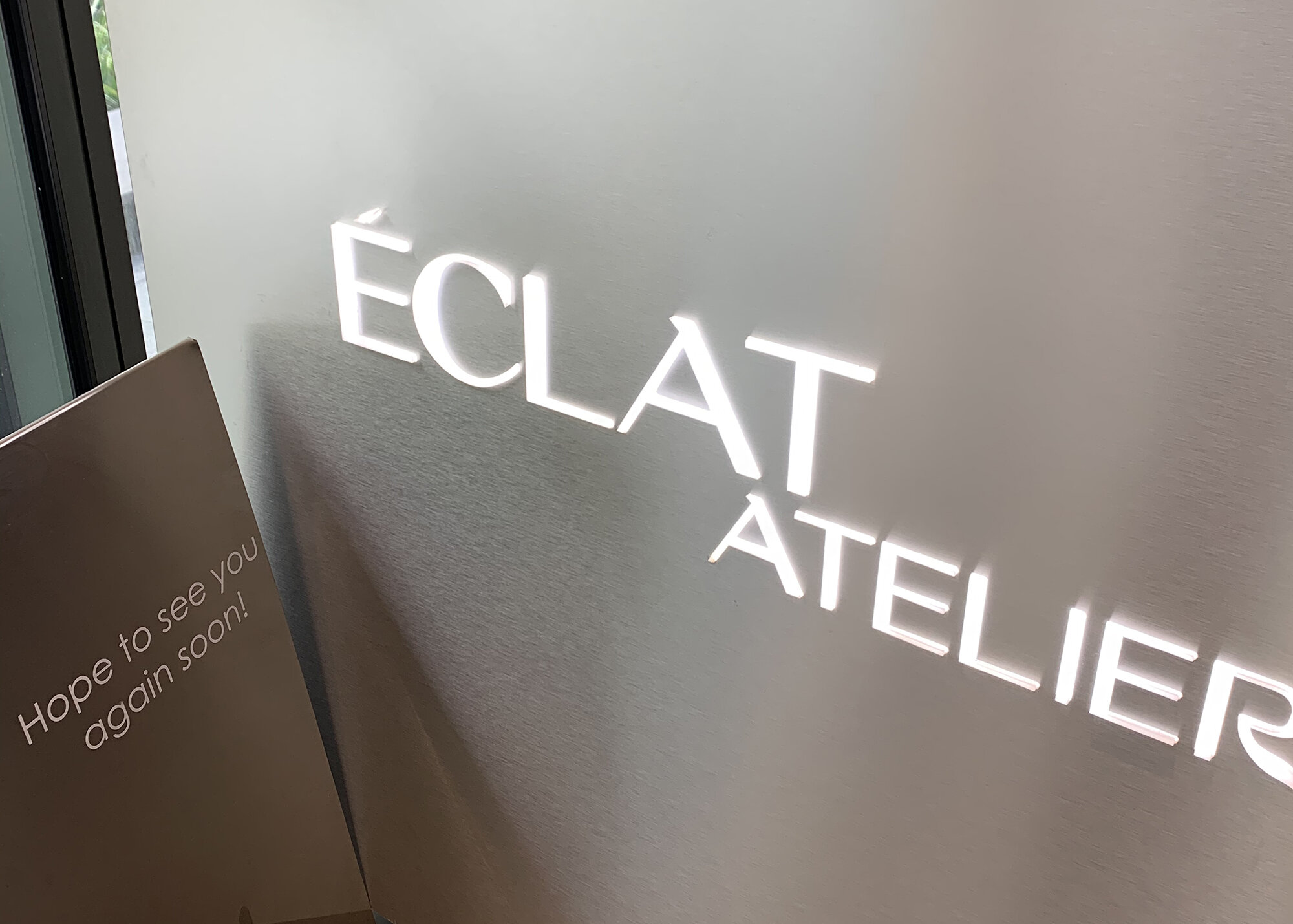
Creativity and Arts aside, the new & expanded Éclat (Atelier) in St Leonards primarily talks to well-being.
By utilising the same unique font as Élcat Atelier, the OG studio, it hints that they are under the same umbrella. This new logo is the main brand medium which appears as signages, on collaterals such as giveaway pouches and aprons.
The goal of this rebranding is to add more character to the logo. This is achieved by employing softer strokes to the letters, which helps to reinforce the essence and tone— notion of water, relaxation and luxurious self-care. Interior was designed by Vie Studio.
FOR —
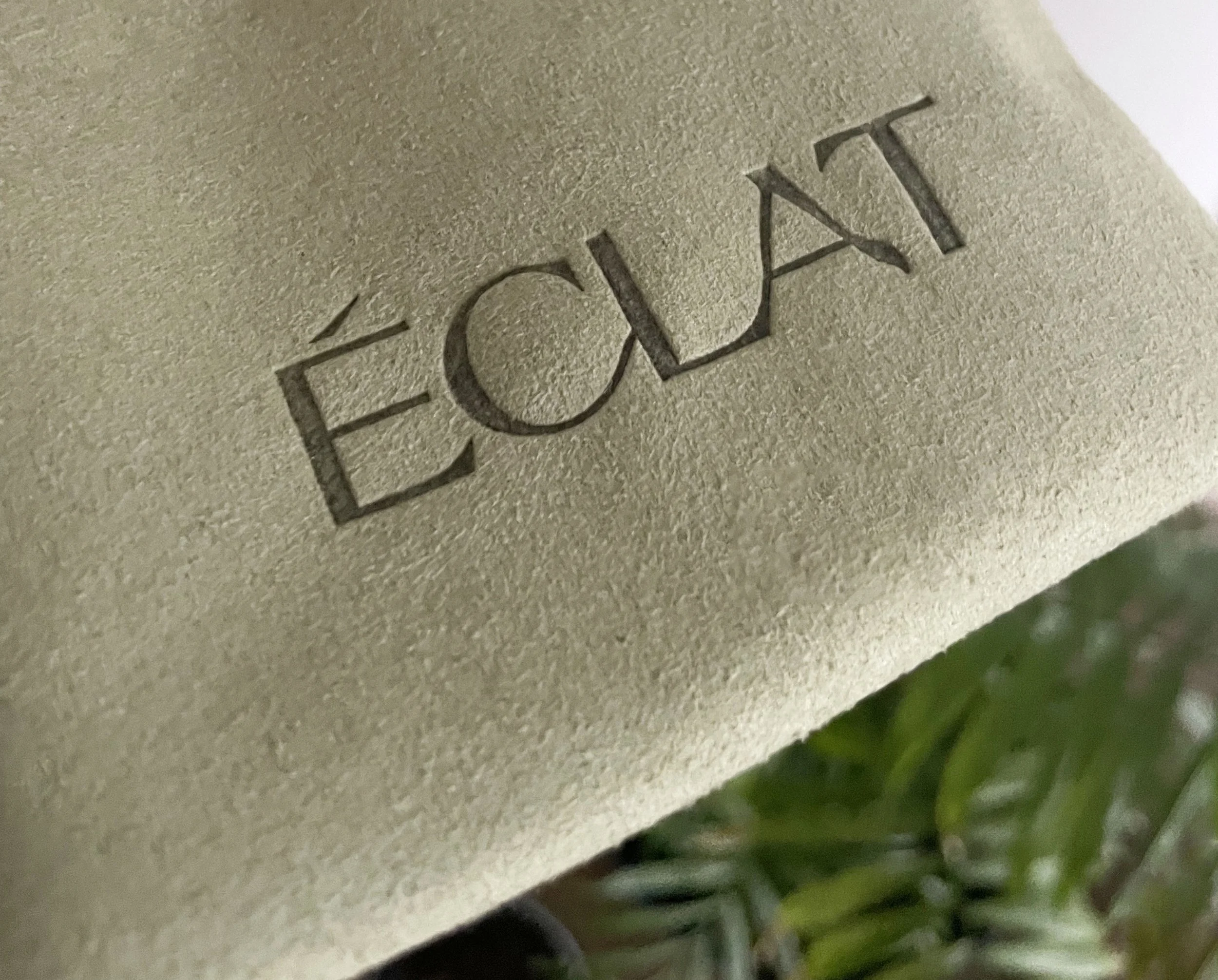
Éclat
In Apr 2024
⤸
Logo Design & Branding
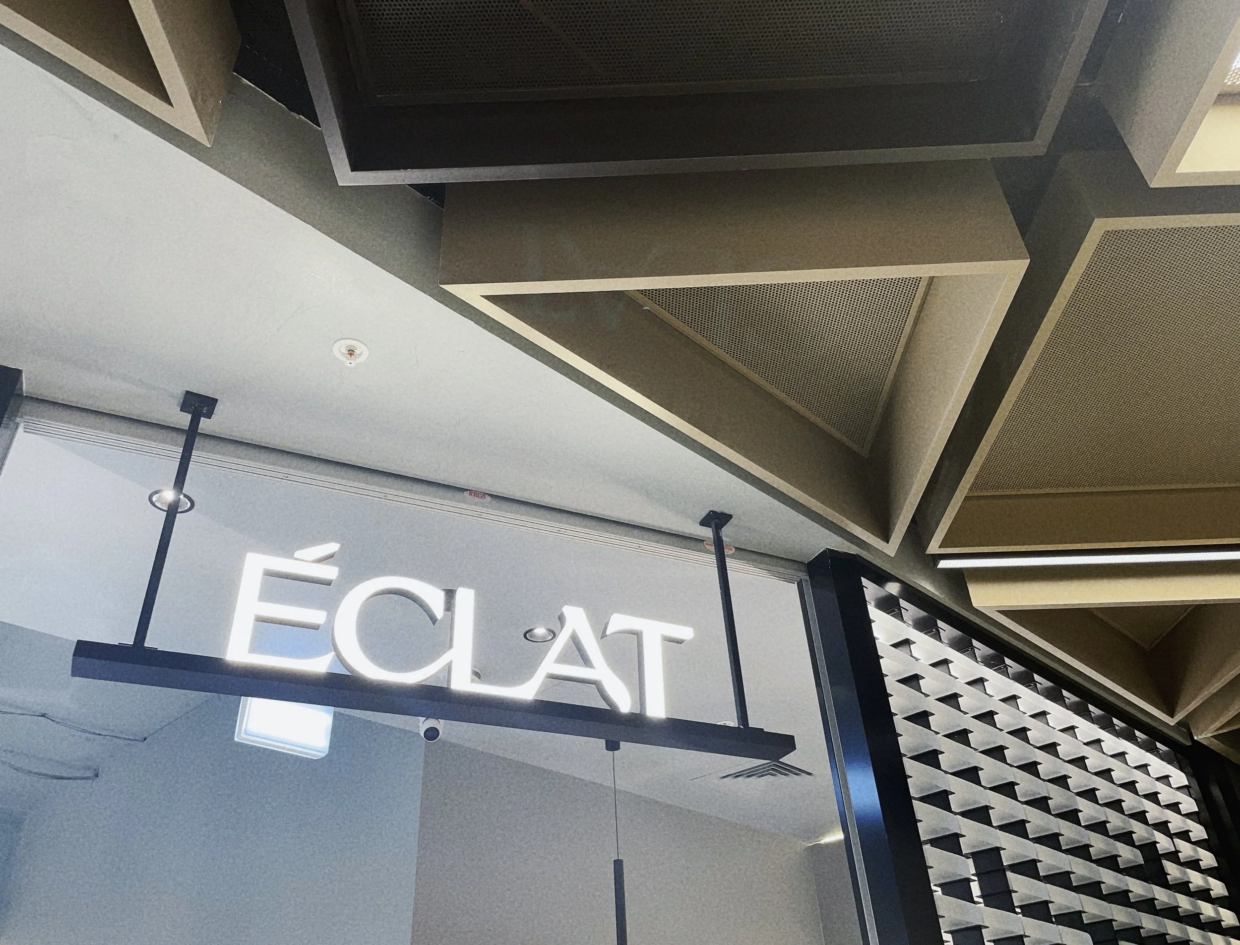
Éclat atelier, the original hairdressing hub in Waterloo, NSW, takes pride in its focus on friendship and creativity.
Tag line is omitted in the logo, letting the name to speak for itself— a bright and flamboyant workshop.
Our modern and sleek typographical response reinterpreted a typical image of a hairdressing place, highlights the presence and boldness of Éclat atelier. It is in the hope to bring an iconic and long-lasting impression to the audience.
FOR —
Éclat Atelier
In Jun 2019
⤸
Logo Design for Interior