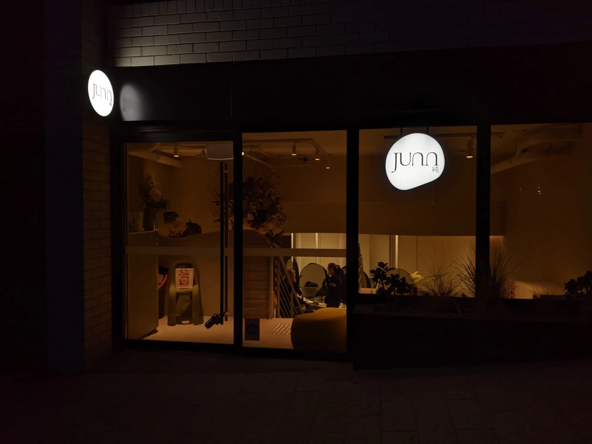

Junn is a collective of hair and beauty technicians based in Milson’s Point NSW. Providing a calm and serene ambiance and exclusive services, It is in the hope of allowing customers to fully embrace the hair styling experience and find their confidence in real life.
JUNN HAIR logo is made up with curves and oval shapes, which is inspired by the Canyon house by Charlotte Taylor. The entire logo is rendered based on font Adobe Garamond; while 'n's are replaced with a flipped "u" to create balance and connections.
The Japanese kanji “純” is crafted and placed at the left end to create an idea of “full stop”, which turns JUNN as a statement, which is convincing and firm.
More info: @www.junnhair.com | Follow them on ig: @junn_hair_
FOR —
JUNN HAIR
In 2021—2022
⤸
Branding
Logo Design
Totebag Design
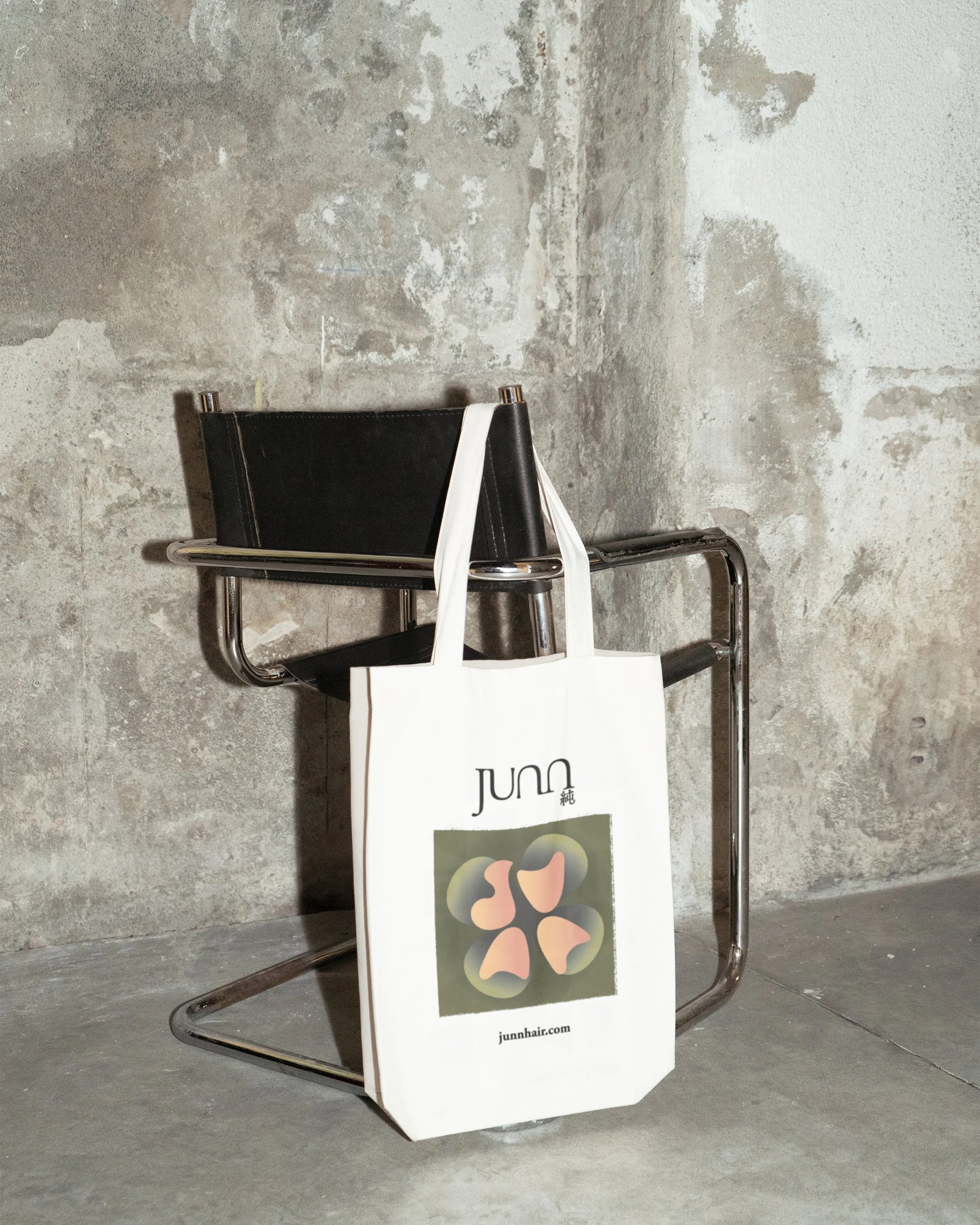
The colours were chosen carefully to make sure it goes along with the overall branding. Muddy Green Petals blend into the background, while the shapes worded “JUNN” stand out in the Skin Pink colour. Rugged edge are created to mimic screen-printing effect, which is personal and unique.
A Junn Totebag.