Water Sommelier, Sip N’ Somm, is your your trusted Water Specialist. They provide services from water consultation to training and education in Hong Kong. The brand is bold, professional and approachable, creating a confident presence in the field.
FOR —
Sip N’ Somm
In Jan 2026
⤸
Ideation
Logo Design
Branding
—
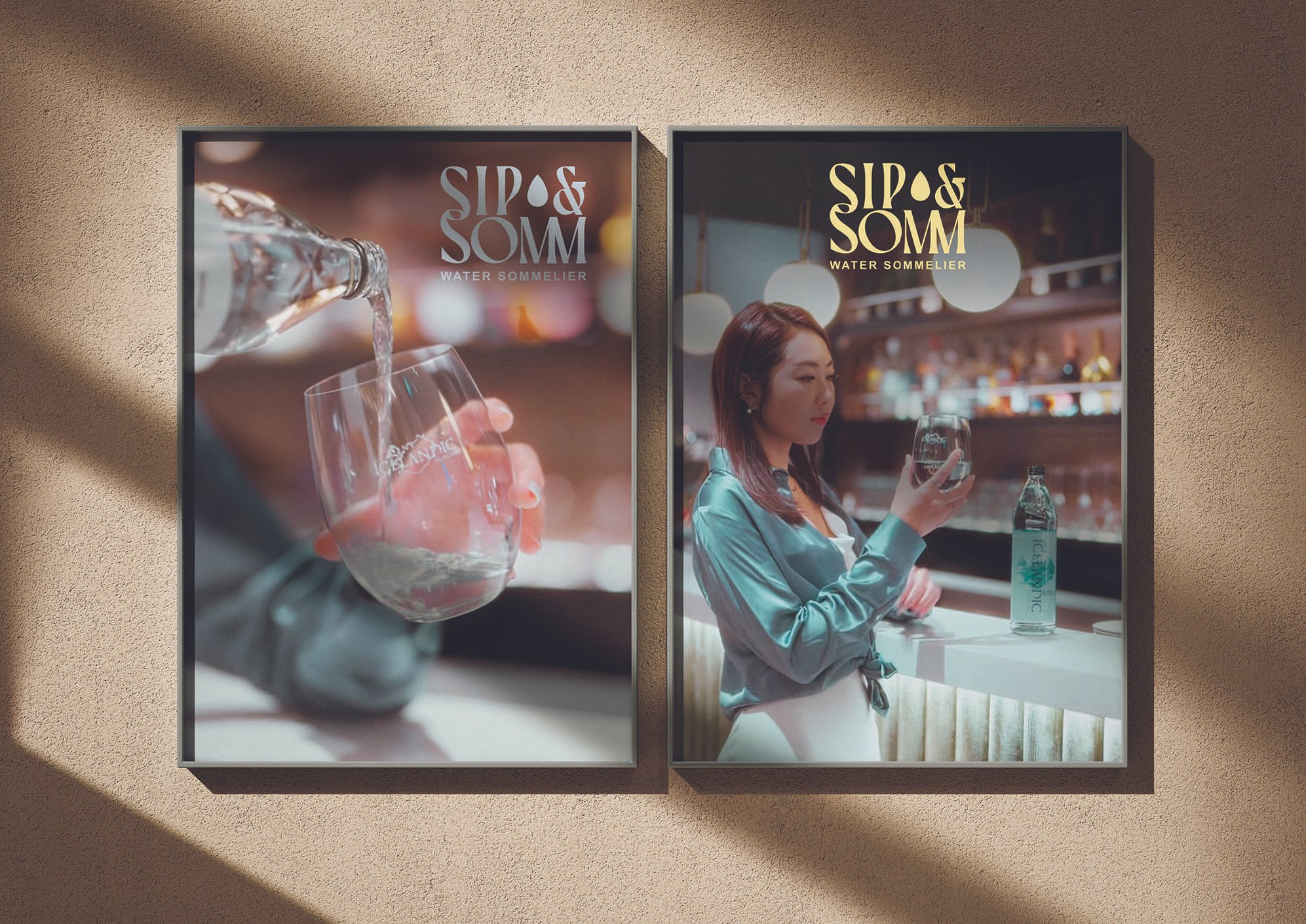
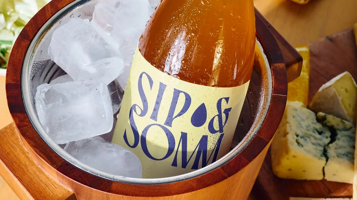
Mock up from Benito Mockup.
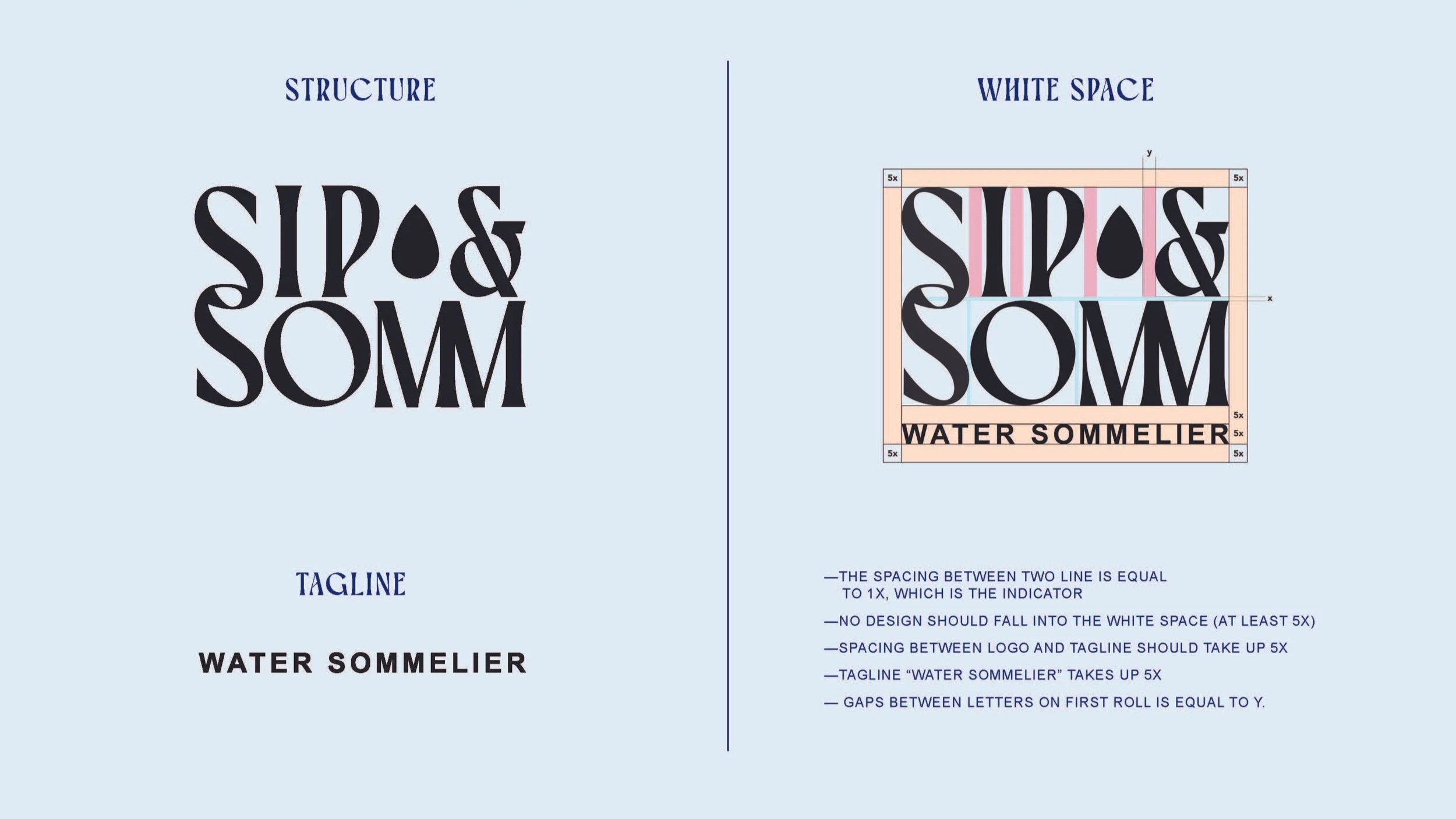
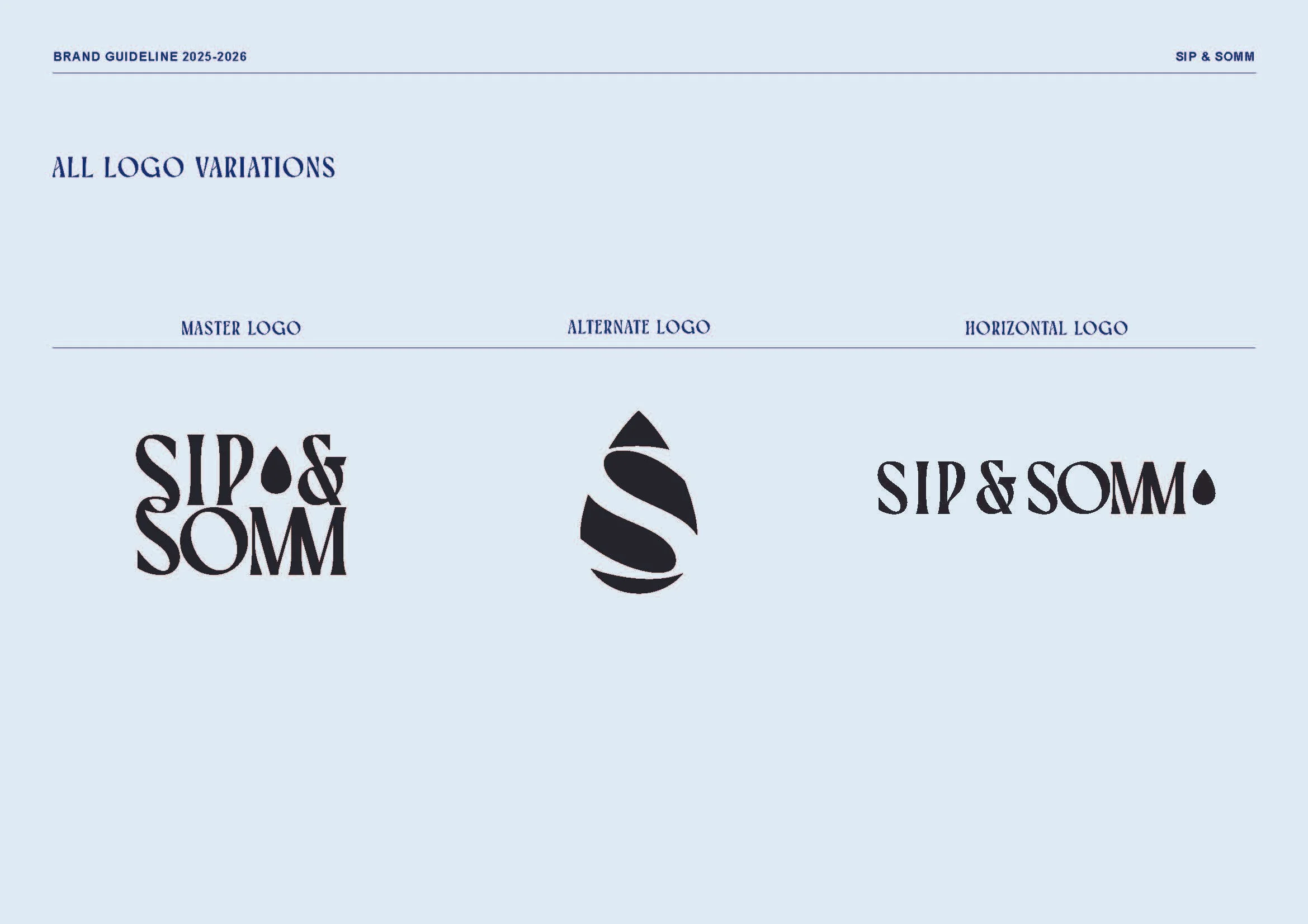
Hierarchy
‘Sip’ & ‘Somm’ are in the same letter size for consistency as they are of the same importance.
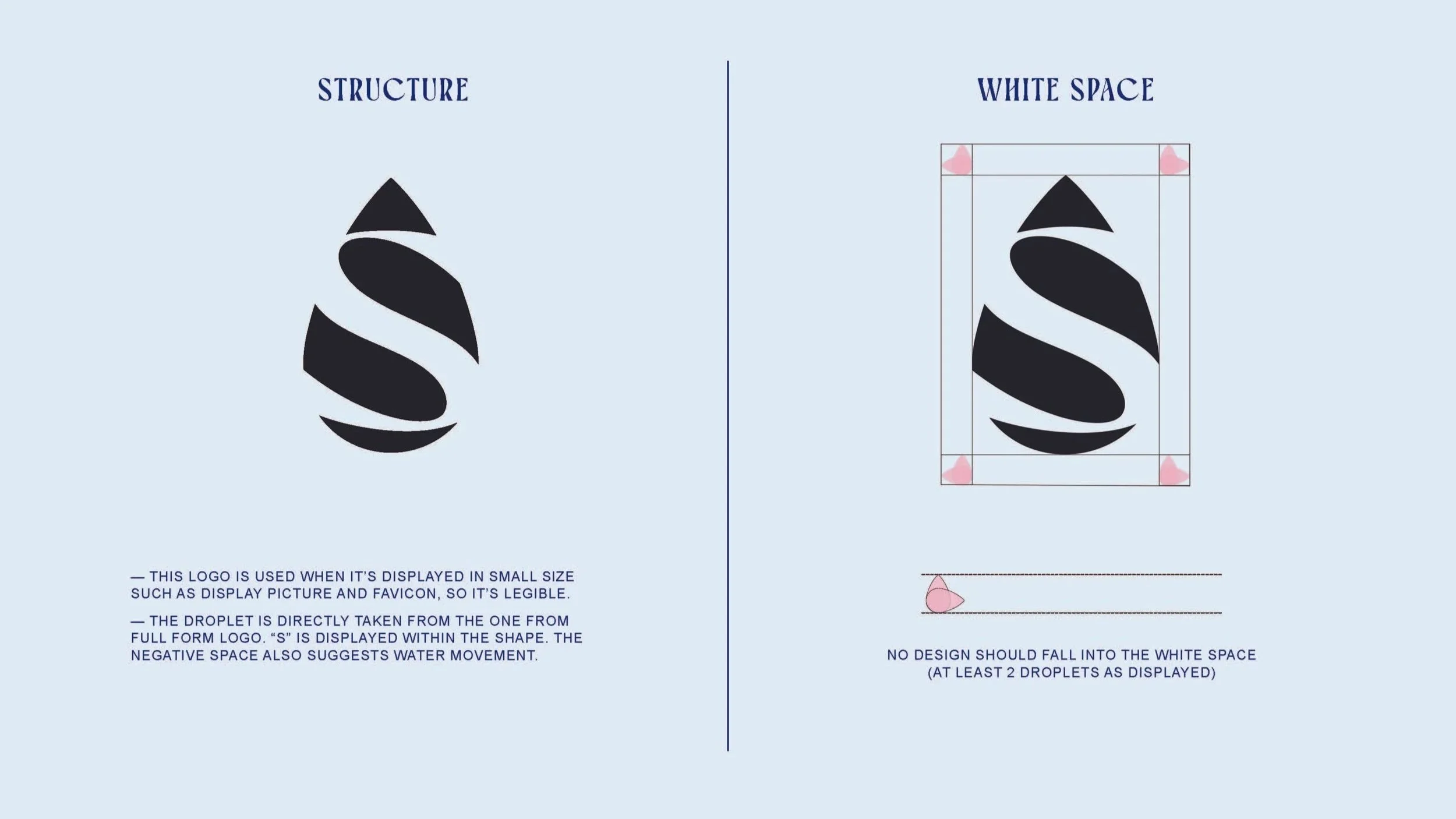
Droplets
The symbol of droplet is used across the entire branding. For example, in the logo, the two “s” creates a negative space which shows a droplet
Adaptability
Main logo design is squared off to ensure it is visually balanced and nicely structured. The logo also comes in horizontal and abbreviated styles to ensure adaptability.
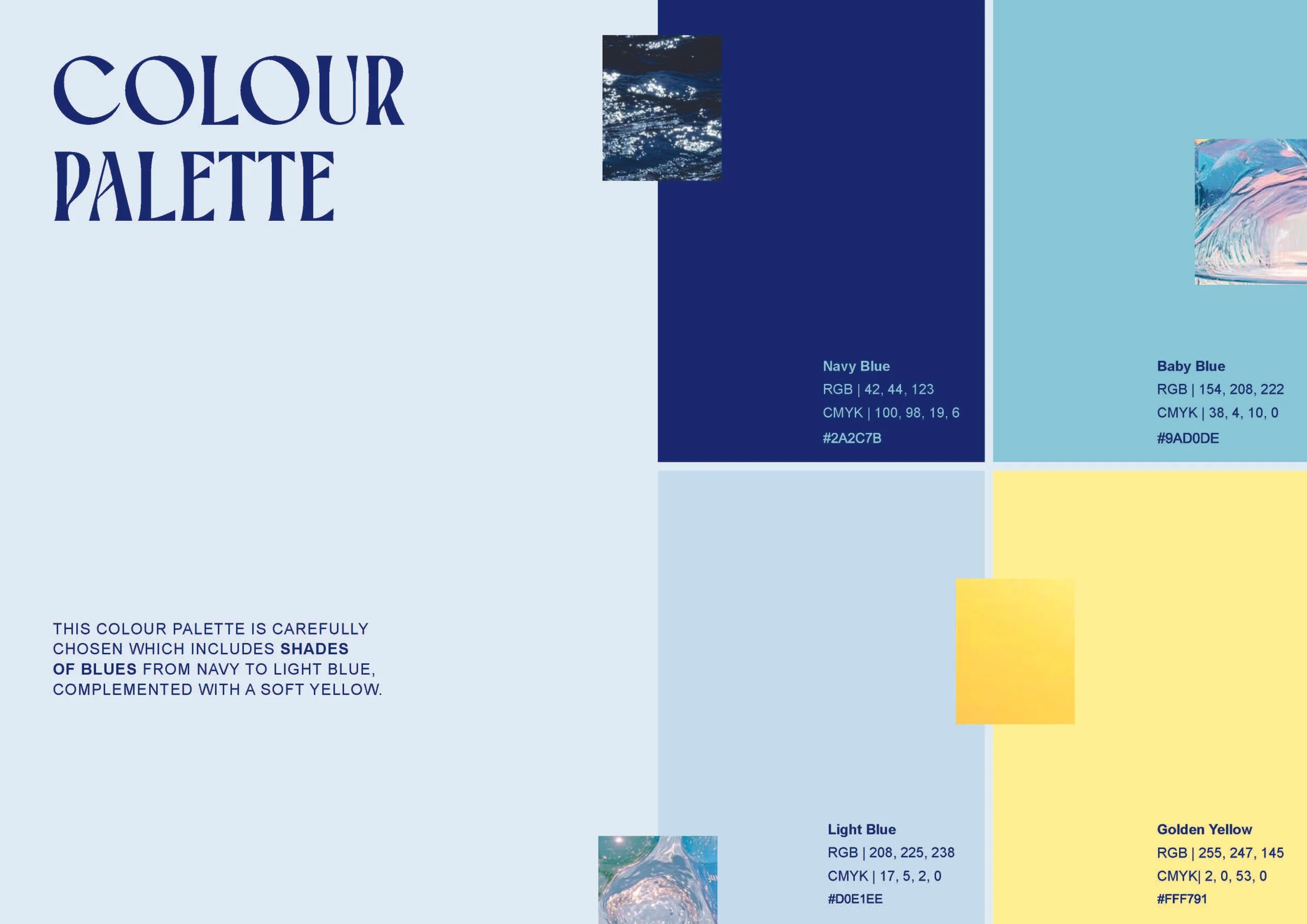
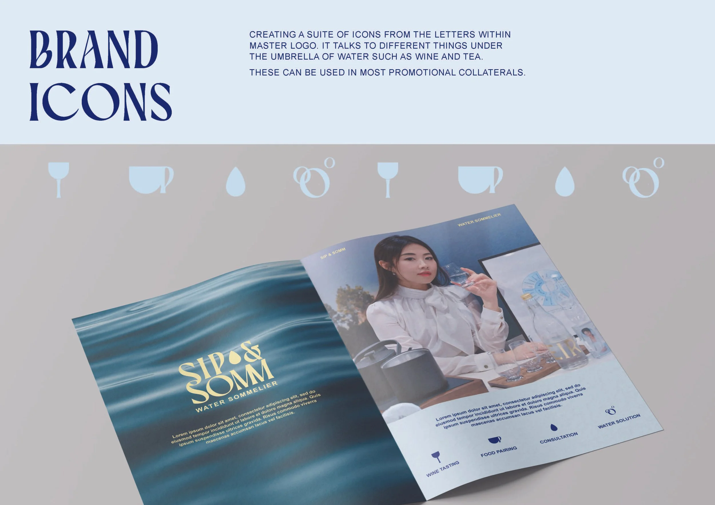
A brand system
From logo to colours as well as icons, they are considered thoroughly based on the Gina’s ( the owner) interpretation of Water and it reflects positivity, balance and brightness the brand brings. A suite of icons are created which are derived from the letters within Master logo. For instance, the “P” is used in the tea cup handle icon the “O” forms the bubbles icon, which hints alcohol. They all speak to different elements under the umbrella of “Water”. These can be used across most promotional collaterals.